
METROLINX
Modernizing Mass Transit Access
THE ASK
Design the next-generation Metrolinx fare reader while prioritizing accessibility needs. Utilize off-the-shelf components, focus on ease of serviceability, partner with a CM, and support production, deployment, and installation of ten beta units within eleven months. @Accenture
-
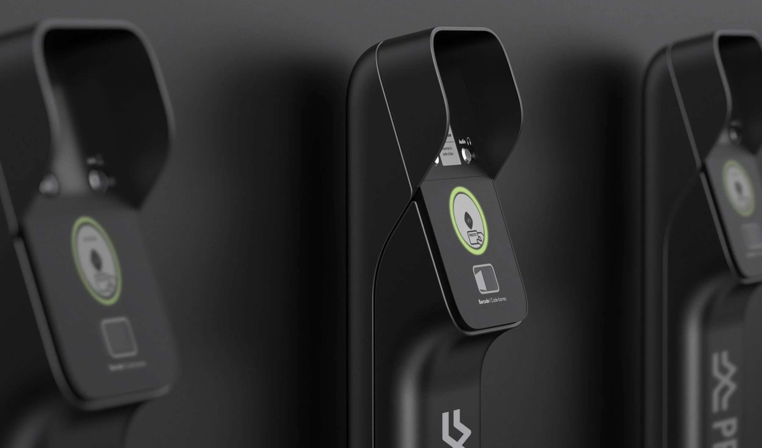
We delivered Canada’s first accessible mass transit contactless reader, reducing rider frustration and easing accessibility. Using off-the-shelf components, we ensured cost savings, upgradeability, and on-site serviceability while creating a distinctive, translatable design language for future products.
-
“This not only means more choice and convenience for our customers, but it also marks the first time a transit agency in Canada is offering a Canadian contactless debit option as a way to pay.”
-
As industrial design lead, I provided creative direction, concept generation, defined strategy and timelines, and oversaw the design for manufacturing process. I worked with an industrial designer, and multiple mechanical and electrical engineers, as well as with the contract manufacturer, and the client to ensure alignment.
APPROACH
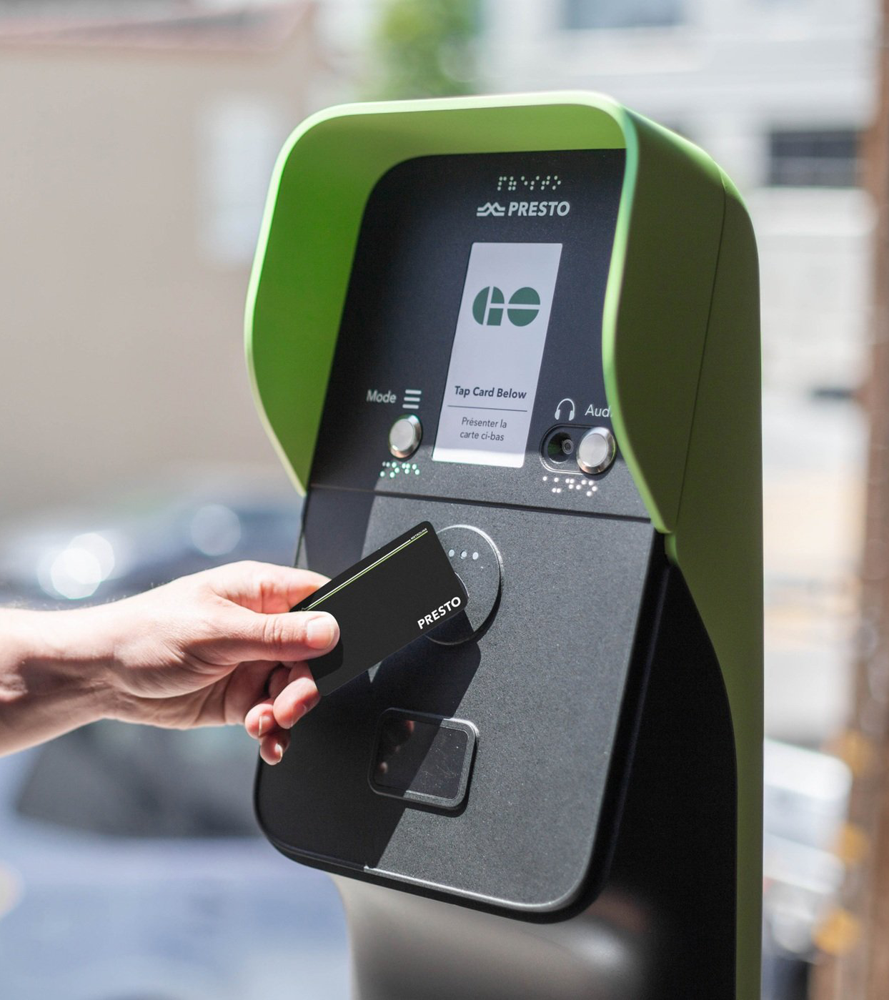
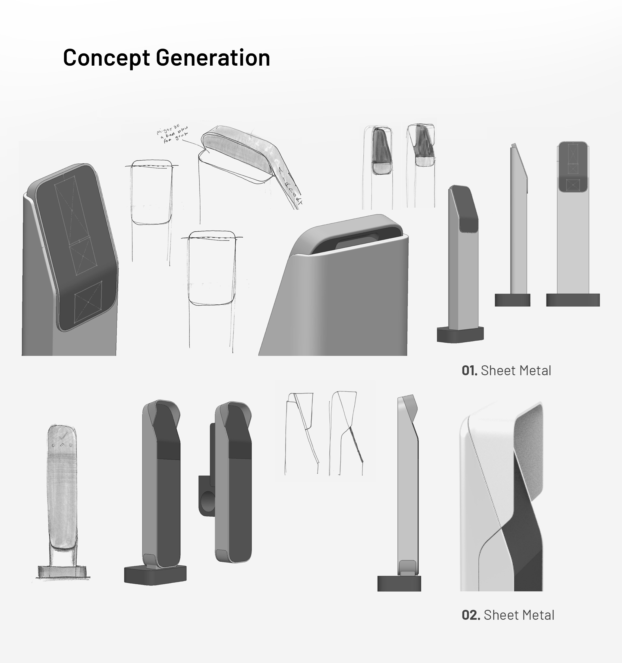
We partnered with a CM specializing in fiberglass molding and sheet metal forming, incorporating their constraints early in our ideation phase saved significant time in DFM phases. Accessibility requirements drove physical interactions, size, and proportions, as we translated our previously established design language on to the new transit reader.

GUIDED BY TWO MANUFACTURING PROCESSES
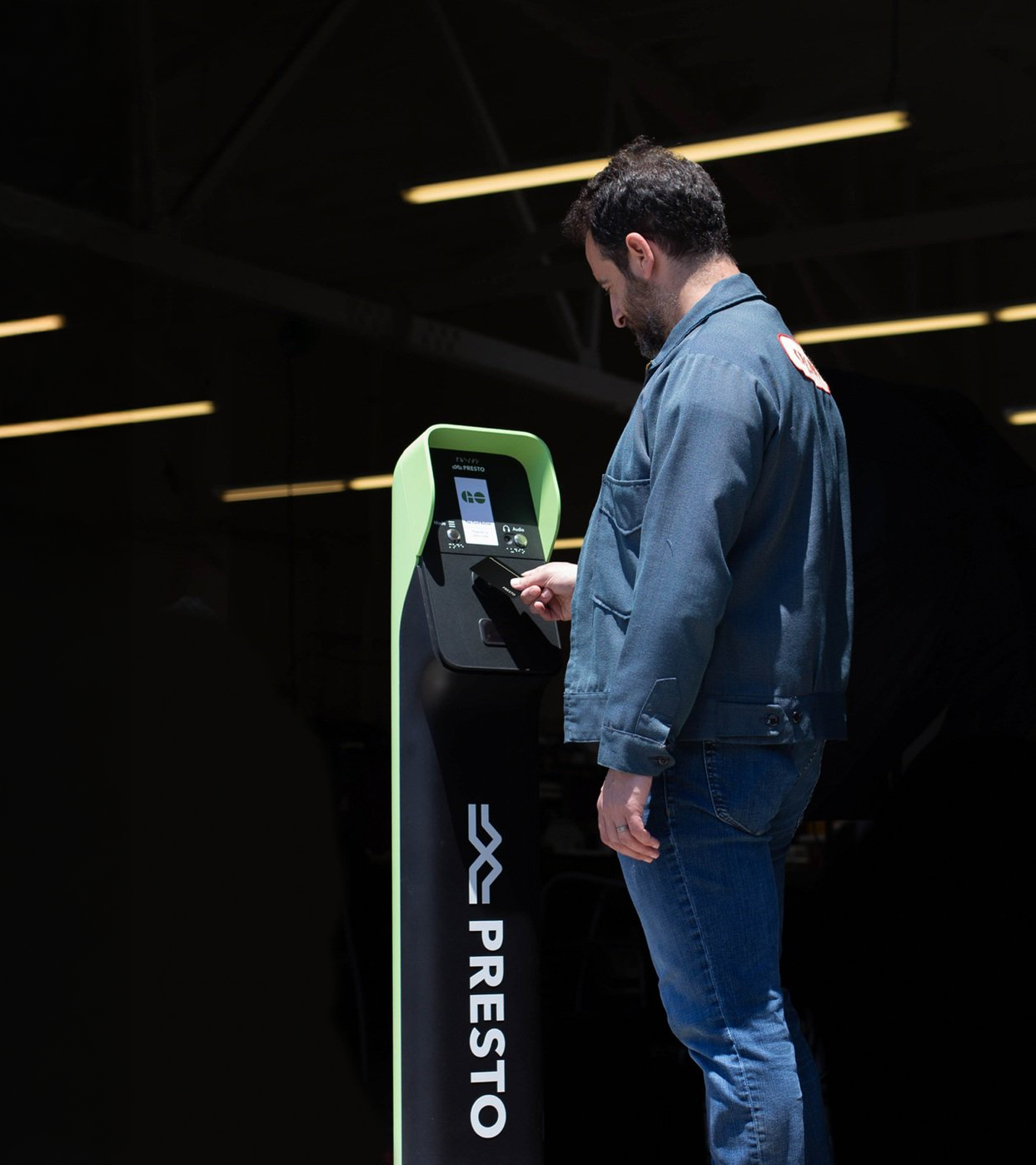
We partnered with a CM specializing in fiberglass molding and sheet metal forming, incorporating their constraints early in our ideation phase saved significant time in DFM phases. Accessibility requirements drove physical interactions, size, and proportions, as we translated our previously established design language onto the new transit reader.

INFORMED BY ACCESSIBILITY NEEDS
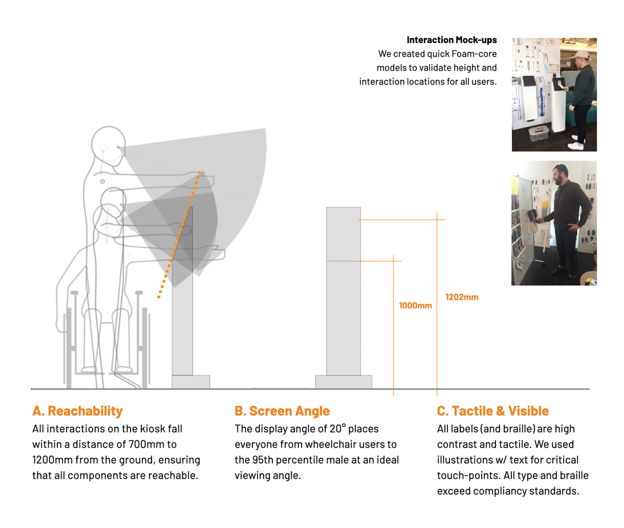
We started ideating with volume studies guided by ADA and AODA accessibility guidelines, informing size and proportions. Our decision-making prioritized accessibility ease and clear communication.


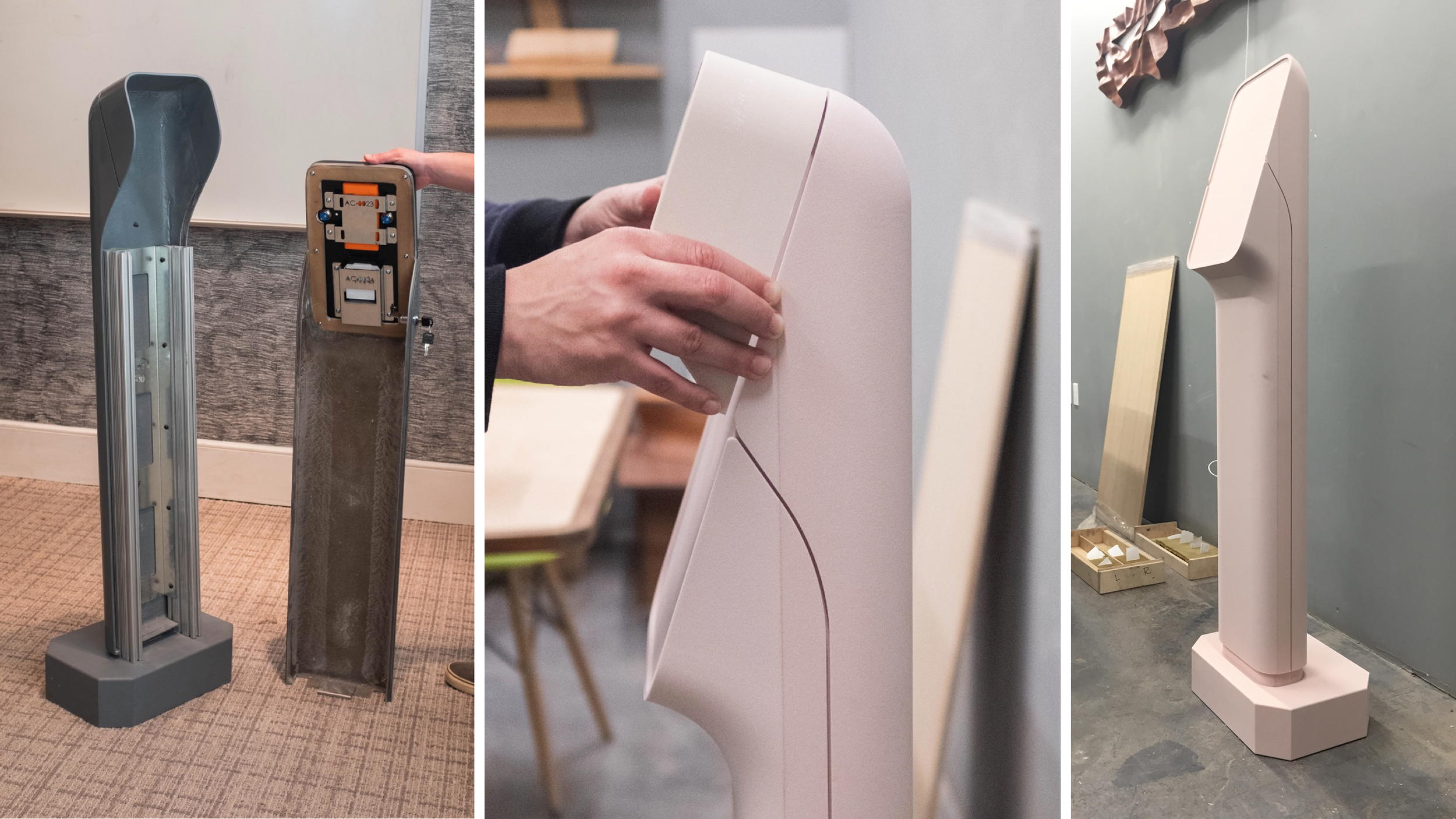
FUNCTIONAL & COSMETIC PROTOTYPING
Our design and engineering team paralleled building prototypes to test functionality and validate design intent. These were invaluable tools for cross-collaboration with each other, manufacturers, and key stakeholders.

We combined our human-centered design approach with our agile for hardware mindset to deliver a frictionless and accessible fare reader in eleven months.